IE7 (a.k.a. Microsoft Windows Internet Explorer 7 Beta 2 Preview)
Hi, My name is Daniel, and this is Internet Explorer 7 (The Official Name is "Microsoft Windows Internet Explorer 7 Beta 2 Preview"!
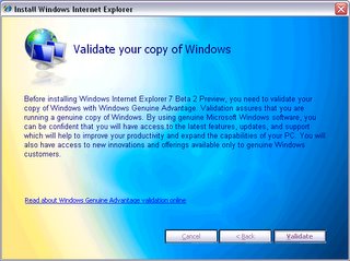
After downloading the Installer, you are presented with a clean Installation interface:The EULA, according to EULAlyzer, contained few Interesting words. If you want the full text, you can get it here.
To Install IE7, You must Validate your Copy of Windows (we all love doing that, don't we).
You then have to download and install any updates to Windows (and, for that matter, Internet Explorer), as well as run the Microsoft Malicious Software removal tool.
In the installation process, it changes your browser's Search page...
...Your default Home Page...
...And your default Search Engine.
When you launch Internet Explorer, the window looks something like this:
Take a look in the About Box if you are still not convinced that something is different.
The New Internet Explorer has Support for the Open Search Standard, which hopefully means that developers won't have to create 50 million different plugins for five different browsers for one website. Another good thing is that there is now more Pathetic Dog or weirdo in a car! Yahooooooo! (Sorry, Yahoo! Inc.) The feed discovery seems to support both Atom and RSS. Personally, I like the way IE7 (sorry!) handles Feeds as opposed to Firefox 1.5. The Feeds feature supports enclosures, so that means it also supports Podcasting. Something newcomers to Feeds will like is the "Friendly" interface that IE7 gives to feeds. Microsoft has done some very innovative things (Microsoft and innovative in the same sentence... Something's Wrong here...) with tabbed browsing. Such innovative Things include a live preview of everything that's in each tab and the tab close button is on the tab itself, as the location of the close button in Firefox is something that can be confusing for first-time Users. One problem that exists in this build is that you can not go to another tab while the page is still loading, or it will go to about:blank (a blank page) in the original tab. Something else that you can do in IE7 is, similar to how control-enter adds "http://www." and ".com" to the URL, alt-enter opens it up. Control-alt-enter, however, will not complete the URL and open it up in a new tab. Back on the topic of search, IE7 has an emphasis on search (similar to Windows Vista), and not just MSN Search. You can add a wide variety of search engines (see http://www.microsoft.com/windows/ie/searchguide/default_new.mspx), and developers are working on more. Security (finally!) is another emphasis of IE7, via the New Security Shields and a built-in, turned-on-by-default phishing filter. I couldn't test out the phishing filter (isn't it strange how when you want a phishing site, you can't find any, but when you don't want it, you find dozens...), but I'll assume it works alright. Something new about the interface is that Microsoft has done away with the concept of FEV (File-Edit-View) and the All-of-the-icons-are-in-one-spot-in-the-corner philosophy and opted instead to spread it out. One more thing: IE7 is Very Slow. I don't know if it's my Internet Connection (although it's probably not because it's much faster in Firefox), but something needs to be done about this.
The following is a picture tour of the New IE:
The Top Toolbar. Features the Back/Forward Buttons, the Location bar, the Refresh Button (That strange green button with the two arrows), the stop button, and the Search Bar. This toolbar is locked in place, so not even clicking "unlock toolbars" will unlock it.

The Bottom Bar. It contains the Sidebar button, the Add to favorites/Subscribe Button, the Tabs, The Home Button, the Feeds button, the Print Button, the Page Button (Similar to the view button in IE 6), and the Tools Button. Not seen is the Help Button, the Research button, and a space for other programs to put their buttons (Why can't Microsoft get rid of this).
The Information Bar. Hasn't changed much, except for maybe a few new messages.
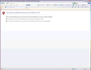
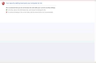
The Browser Window featuring a Security Warning. Also an example of the "Security Shields."
The Status Bar. The Shield on the Left-Hand Side is an indicator of the Security Status of the Website. The "Zone" Indicator is still there. New to the Status bar is the Zoom Button. The Zoom button does just that: it zooms in on the entire page.
An example of how IE7 handles Feeds. In this windows is my own feed. At the top, IE displays the title of the feed, followed by the date it was last updated. Each feed item is listed next to a bullet with the name and Date of Posting. On the right is a search box, followed by ways to sort the feed.
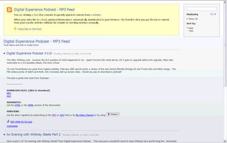
An Example of how IE7 handles feeds with enclosures. For this example, I chose one of my favorite podcasts, the Digital Experience Podcast. You can see that the content is the exact same as the post on his website (www.digitalexperiencepodcast.com), but IE7 adds the Link at the Very bottom (the one that looks like ¯ DEP-2006-02-23.mp3)
The tabbed browsing view. You get to this by clicking on the button that has four boxes in it.
One more thing. IE7 seems to have issue with blogger's entry form. UPDATE: PC Magazine recently did an article about IE7 (Vol. 25 No.5, for March 21st 2006). You can get the article online at go.pcmag.com/ie7.


No comments:
Post a Comment